Creative Success

Corporate Campaign Branding
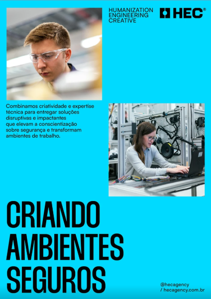
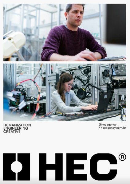
Professional branding and communication design developed for an agency specializing in internal workplace campaigns and awareness communication.
HEC - HUMANIZATION. ENGINEERING. CREATIVE.
Brand Story
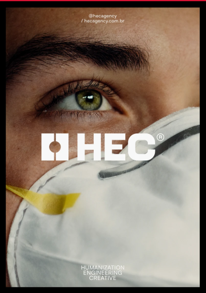
HEC was created as a modern advertising agency focused on internal workplace safety campaigns. The project was developed to build a visual identity that balances technical expertise with creativity delivering strong communication, clarity, and human connection.
The concept behind HEC is based on a simple idea: well-designed campaigns can save lives. Every visual element was created to communicate trust, structure, innovation, and impact while maintaining a modern and approachable brand presence.
Creative Direction
The visual direction of HEC combines technical precision with bold creative expression. The identity was designed using strong geometric forms, vibrant contrast palettes, and modular layouts to create a system that feels dynamic, professional, and memorable.
The design language takes inspiration from:
- Engineering structures
- Industrial communication systems
- Safety signage aesthetics
- Modern editorial layouts
- Creative agency branding
The overall mood was designed to feel:
- Strong
- Intelligent
- Energetic
- Technical
- Human-centered
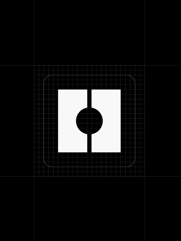
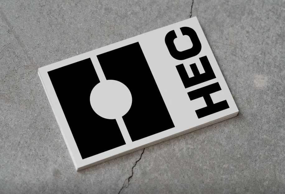
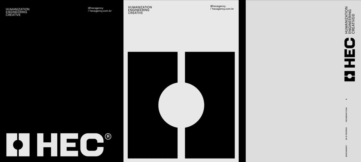
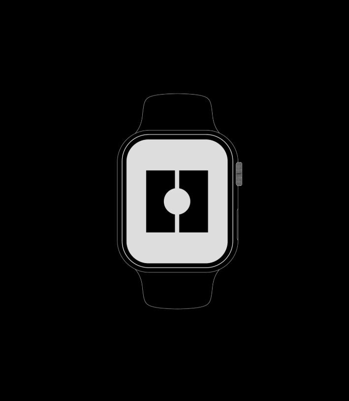
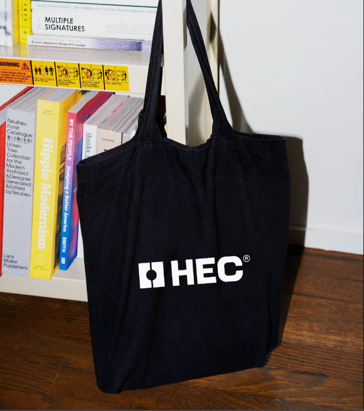
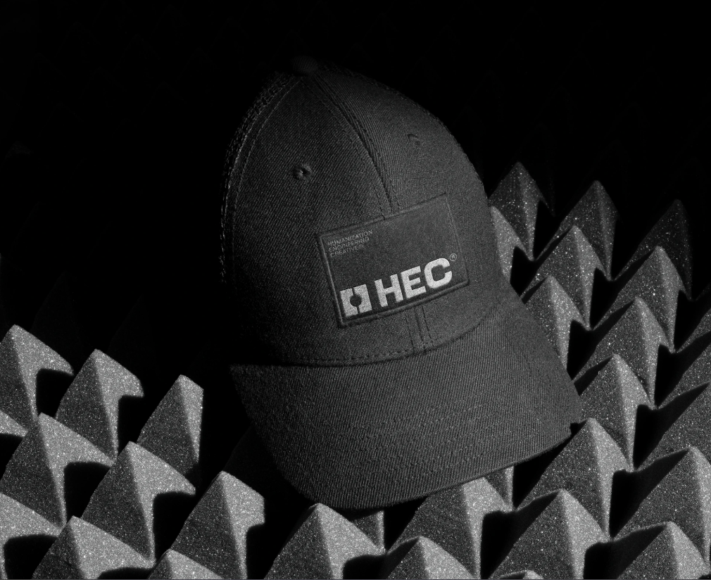
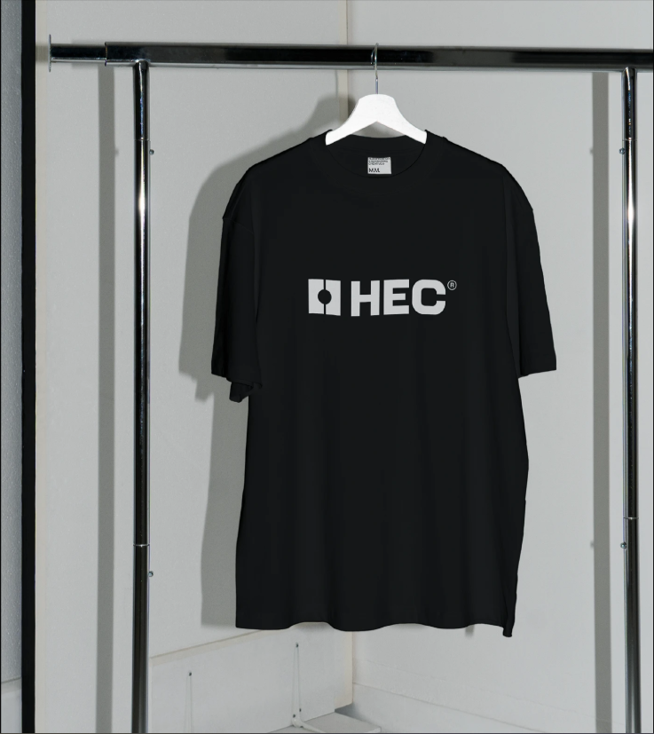
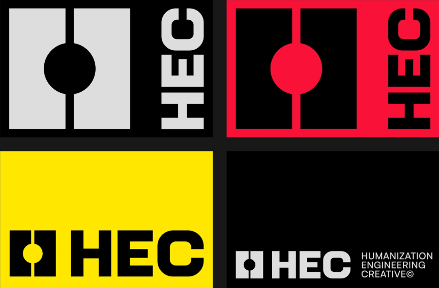
Logo Design
The HEC logo was designed using bold and minimal geometric forms that symbolize:
- Connection
- Stability
- Structure
- Innovation
- Communication
The symbol creates a modular visual language that can expand naturally across different applications while maintaining strong brand recognition.
Typography was selected to balance impact and readability, ensuring clarity across both headlines and supporting communication materials.
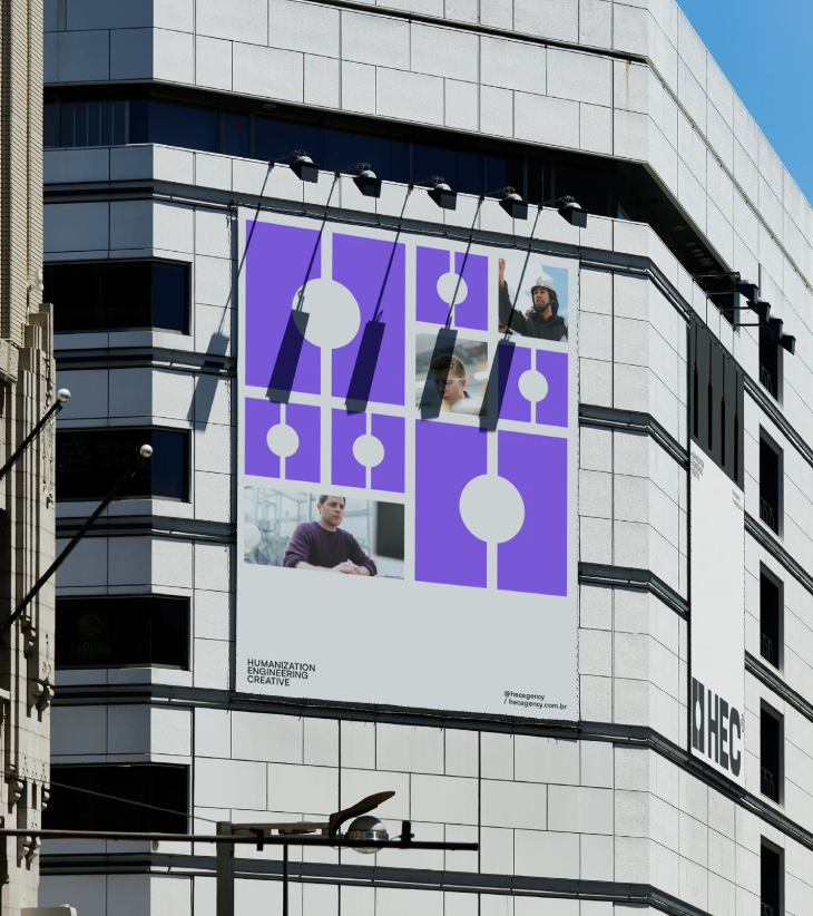
Visual Identity
The visual identity system was developed to create a powerful and flexible communication experience across all brand touchpoints.
Key elements include:
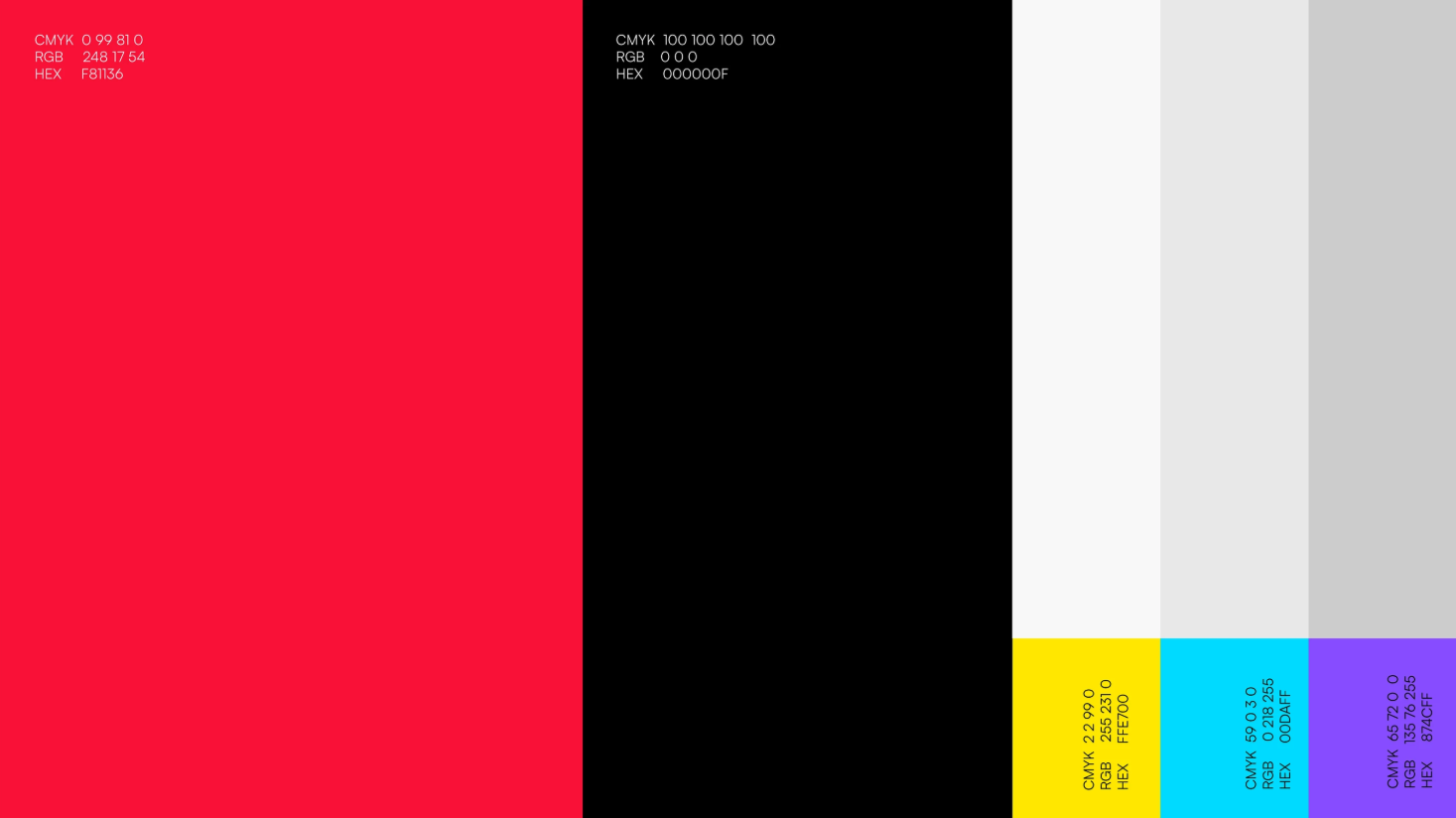
- Bold geometric layouts
- Red and black primary palette
- Vibrant secondary colors
- High-contrast compositions
- Modular grid systems
- Modern typography hierarchy
Every visual component was crafted to reflect professionalism, energy, and clarity.
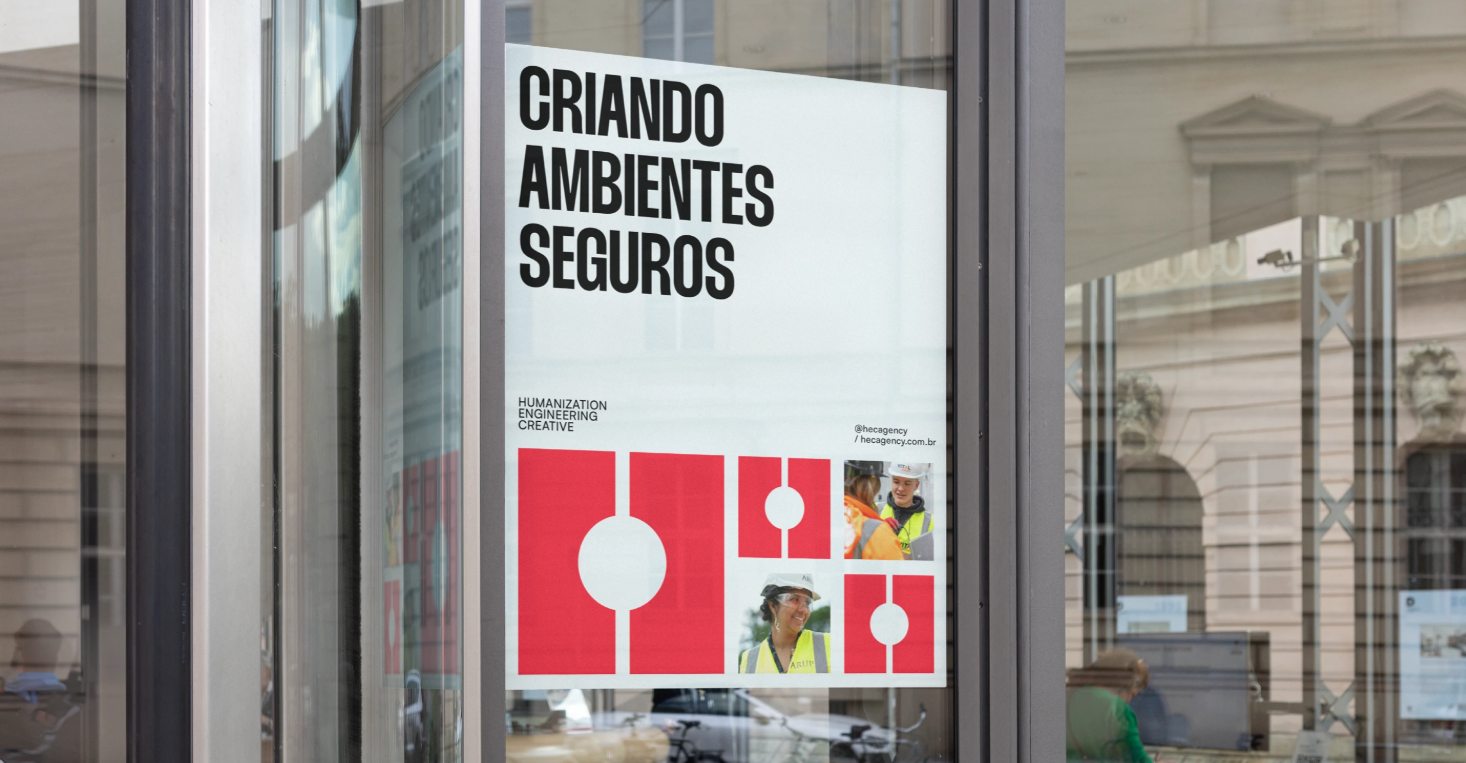
Communication System
The communication design was built to support both internal campaigns and large-scale corporate messaging.
The system includes:
- Safety campaign materials
- Corporate presentations
- Awareness visuals
- Internal communication assets
- Social media creatives
- Motion graphics concepts
- Brand support materials
The modular structure allows the brand to remain visually consistent while adapting to different communication needs.
Art Direction
The art direction focuses on combining technical aesthetics with emotional connection.
The visual approach uses:
- Strong composition structures
- Clean information hierarchy
- Dynamic color blocking
- Minimal industrial aesthetics
- Editorial-inspired layouts
- Impact-focused messaging
The result is a visual system that feels modern, functional, and visually engaging.
Motion Direction
A motion concept was developed to extend the identity through animated communication.
The motion system includes:
- Modular transitions
- Kinetic typography
- Dynamic shape animations
- Brand reveal sequences
- Campaign motion assets
The motion direction follows the same structured and energetic visual language used throughout the identity system.
Final Thoughts
HEC is more than a visual identity project it is a communication system built around clarity, creativity, and human impact. Every design decision was crafted to position the brand as a modern reference in workplace safety communication while maintaining empathy, energy, and strong visual presence.
Humanization.
Engineering.
Creative.