
Elegant and luxury-focused skincare brand identity designed to create a timeless visual experience through minimal aesthetics, refined packaging, and sophisticated visual storytelling.
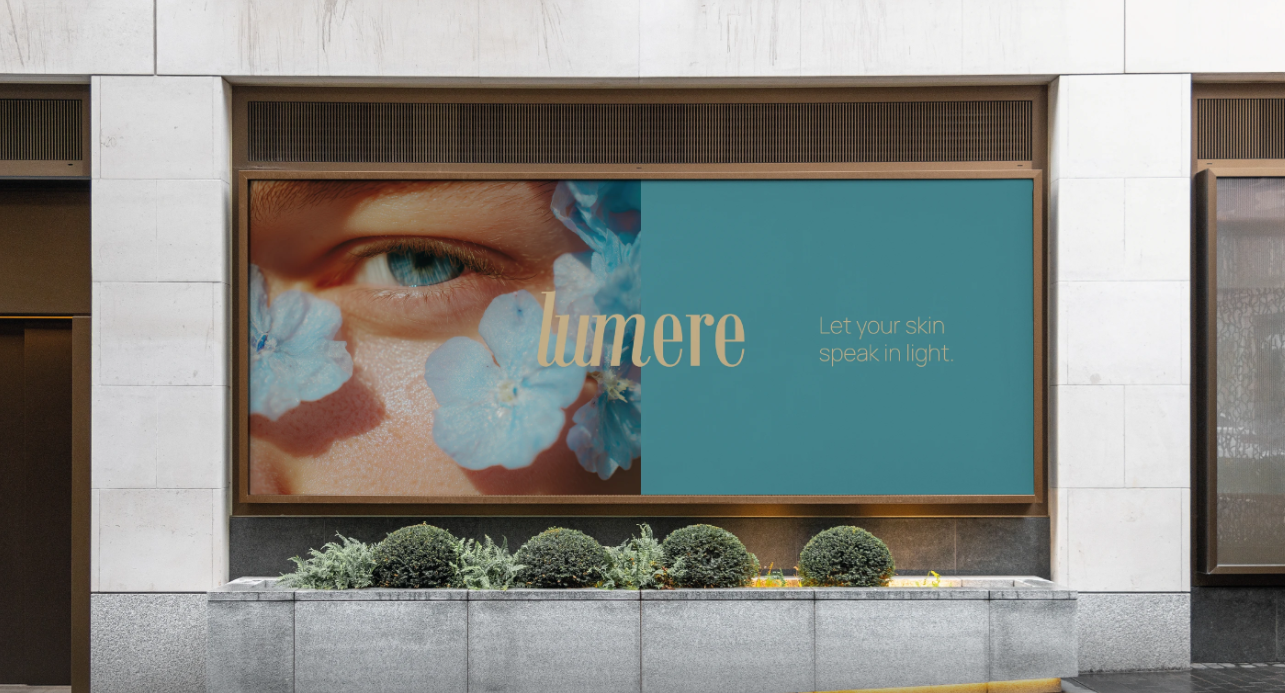
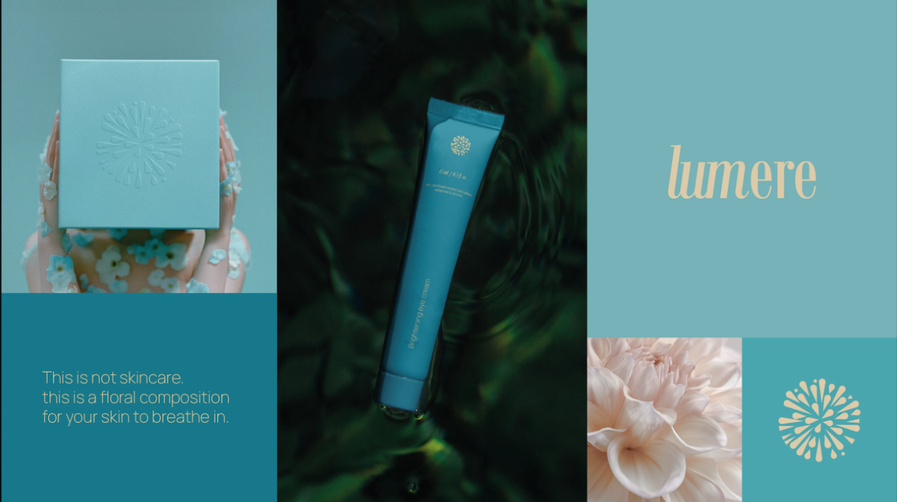
Lumere was created to transform skincare into a calming daily ritual a moment of softness, balance, and self-connection. Inspired by the purity of botanicals and the quiet beauty of natural light, the brand reflects regeneration, elegance, and simplicity.
The idea behind Lumere is simple: skincare should not feel overwhelming. It should feel gentle, intentional, and emotionally connected to the person using it. Every element of the brand was designed to communicate calmness, clarity, and premium self-care.
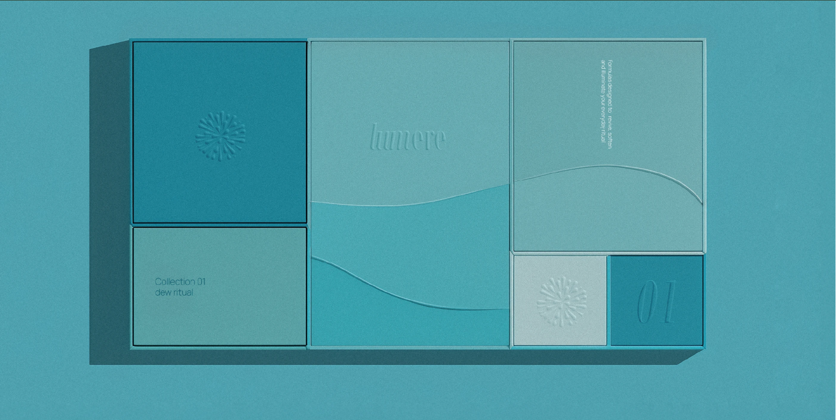
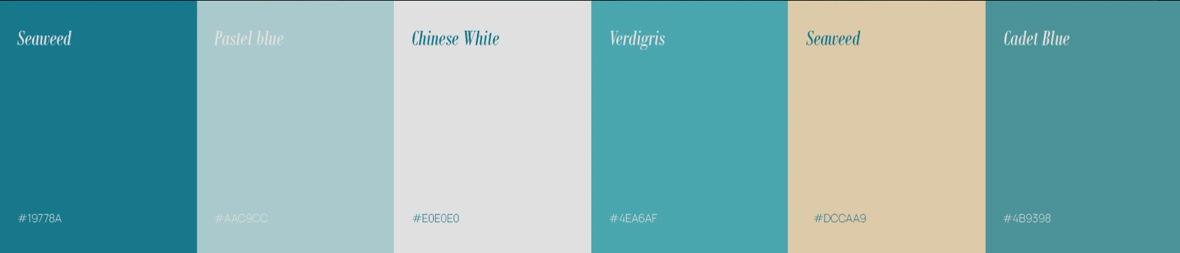
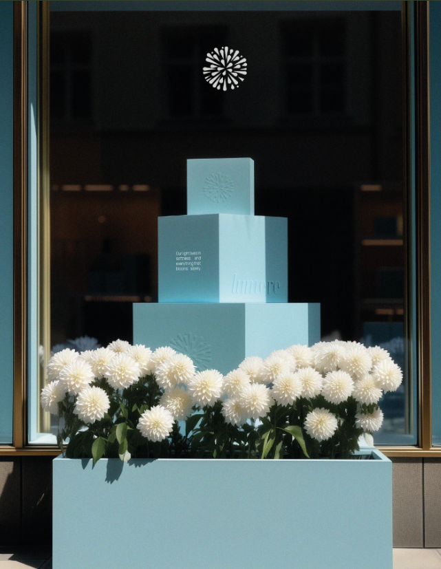
The visual direction of Lumere combines minimal luxury with organic beauty. The identity was built around soft pastel tones, clean layouts, airy compositions, and refined metallic details that together create a sophisticated and modern skincare experience.
The design language takes inspiration from:
The overall mood was designed to feel peaceful, radiant, and timeless.
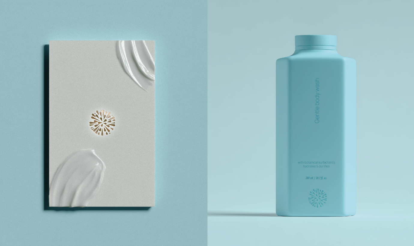
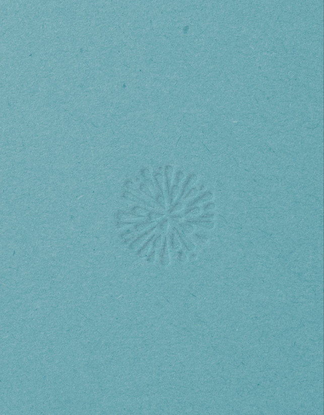
The Lumere logo symbol was designed using a radiant floral-inspired form that represents renewal, glow, and transformation. The shape captures the feeling of a flower blooming under light while also resembling a subtle spark of energy.
The circular construction of the logo symbolizes:
Typography was kept elegant and minimal to maintain a premium and sophisticated appearance while ensuring strong brand recognition across packaging and digital platforms.
The visual identity system was carefully crafted to maintain consistency across all touchpoints.
Key elements include:
Each visual element was created to reflect the brand values of:
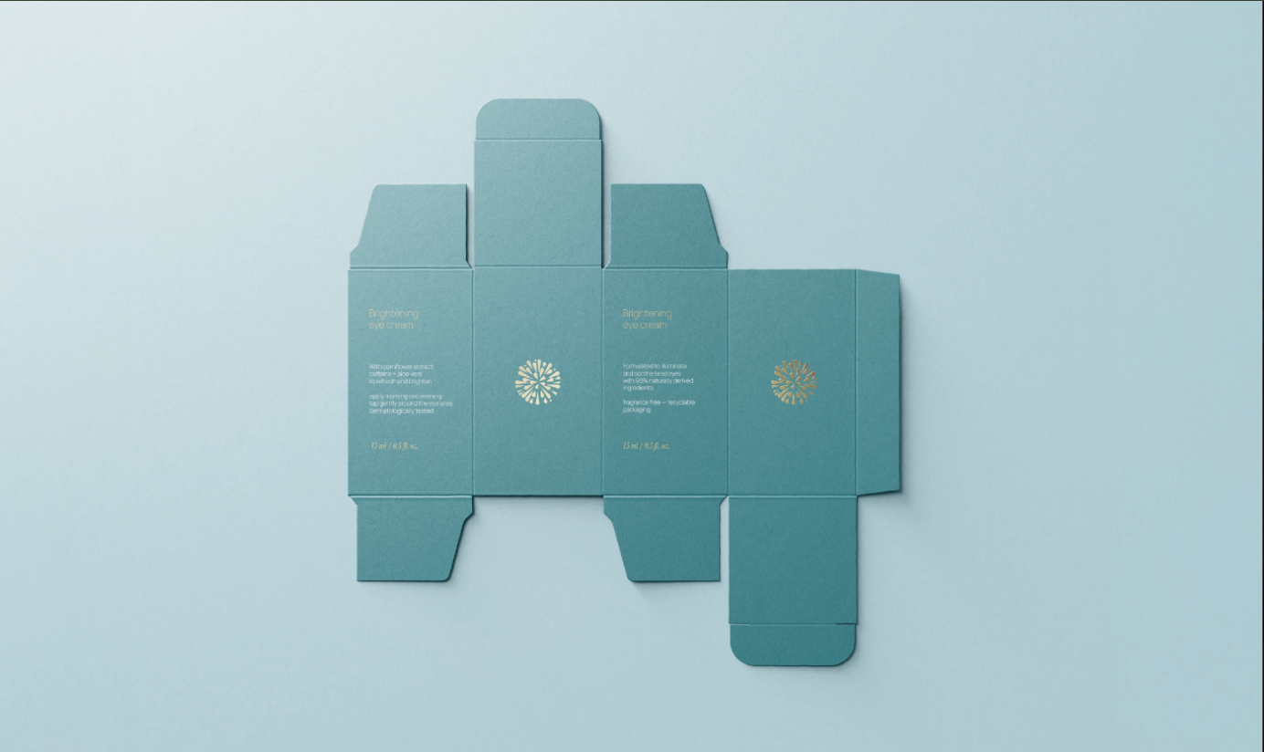
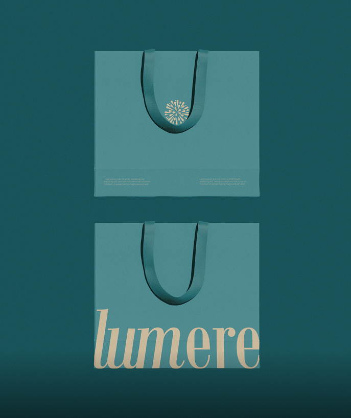
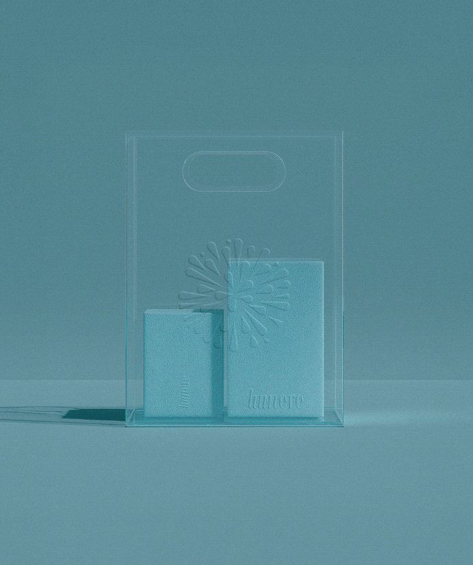
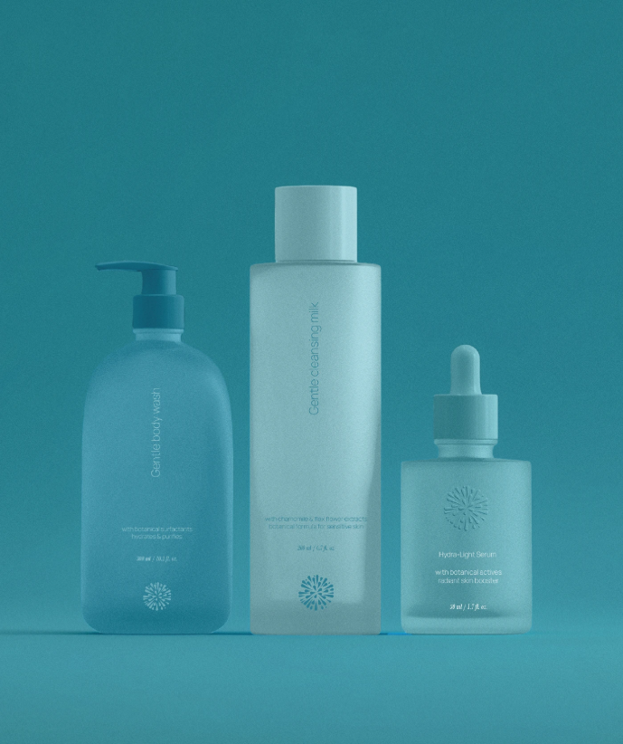
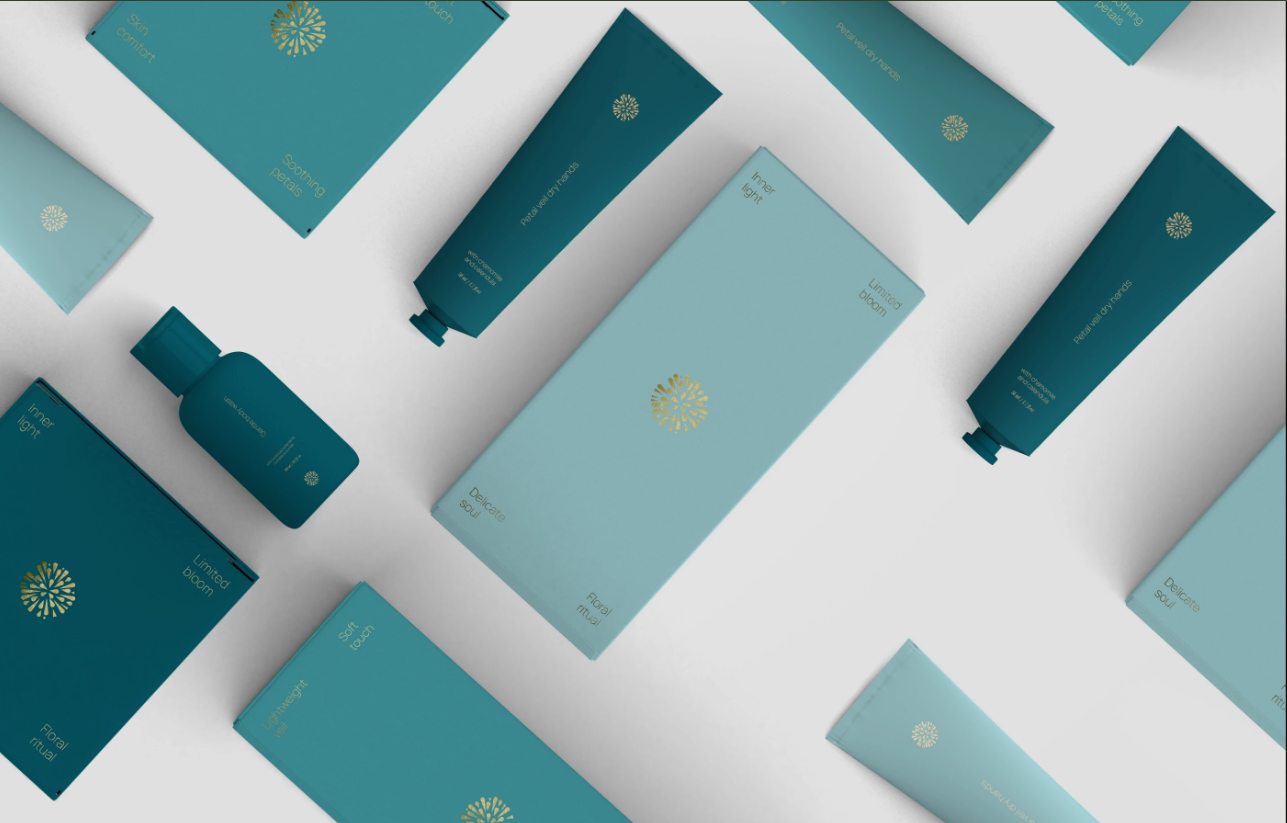
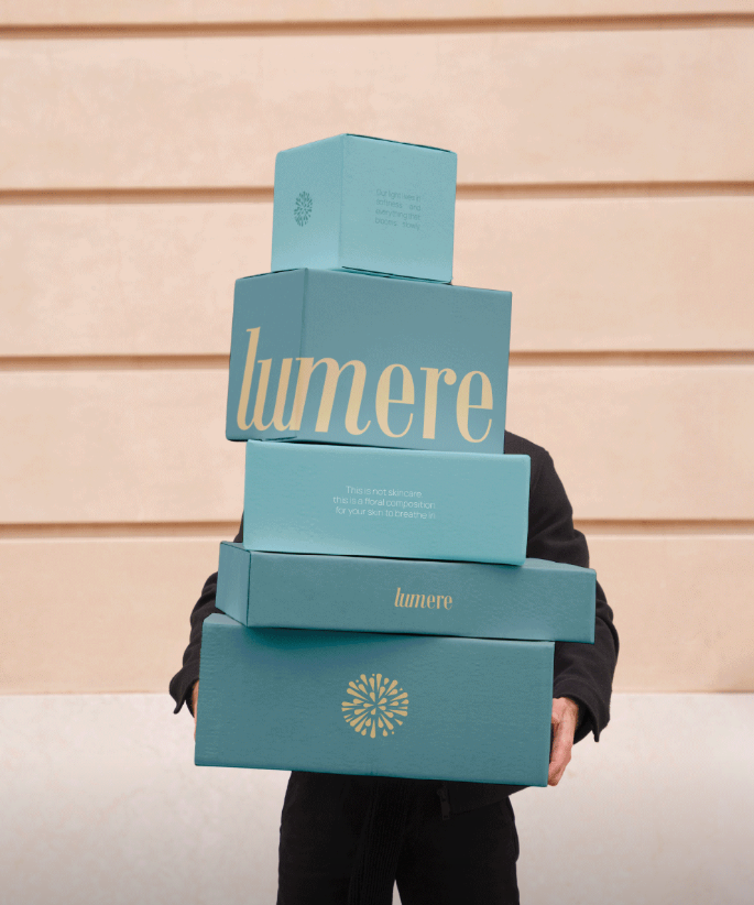
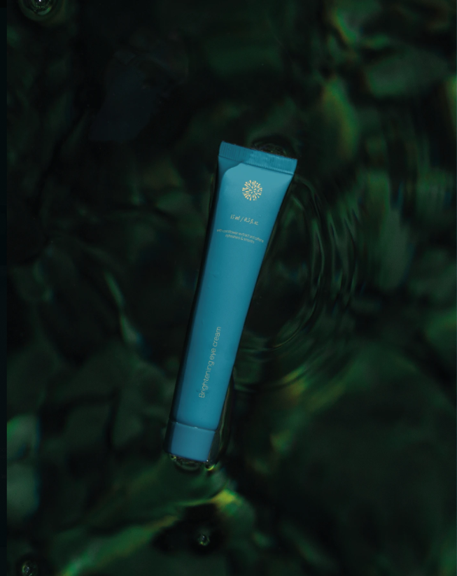
The packaging design focuses on minimal elegance and shelf presence. Every product was designed to feel premium while maintaining a soft and approachable personality.
The packaging system includes:
The combination of matte surfaces, soft lighting, and metallic accents creates a luxurious yet calming unboxing experience.
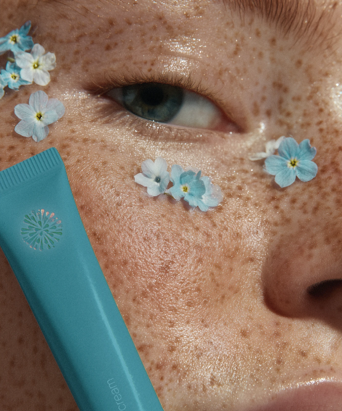
Lumere’s identity was designed to create an emotional connection with users. The entire presentation communicates softness, trust, and self-care through every interaction.
The brand experience focuses on:
Lumere is more than a skincare brand identity it is a visual expression of softness, regeneration, and quiet luxury. Every design choice was intentionally crafted to create a timeless beauty experience that feels modern, emotional, and refined.
Some ideas stay unfinished.
Others bloom beautifully.